EXPLAINER: What the UN ‘Correct the Map’ Vote Really Means
Key points:
- Nigeria, 163 countries voted yes, US voted no, six abstained.
- Togo led negotiations on behalf of the African Group
- Resolution asks for equal-area maps showing true country sizes.
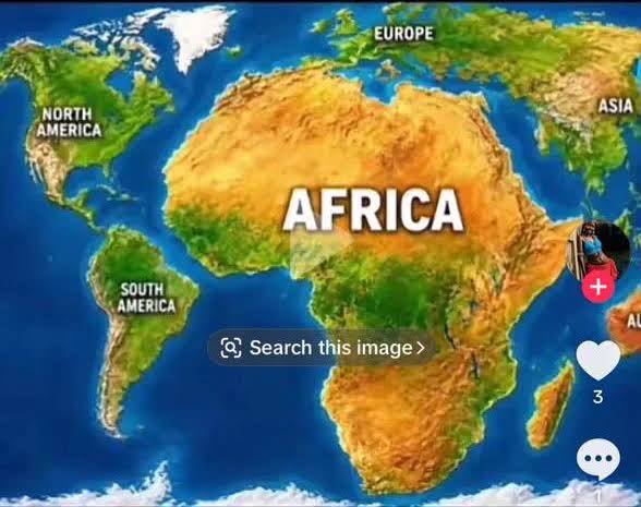
- Mercator maps distort size, making Africa look much smaller.
- Africa is 14 times larger than Greenland, not equal.
- No borders change. No countries join or leave Africa.
- Effect is visual only: Africa appears closer to real size.
By Emmanuel Kwada
The United Nations General Assembly’s adoption of the “Correct the Map” resolution has drawn attention across Africa, particularly in Nigeria, which joined 163 other countries in supporting the initiative.
But what exactly does the resolution change, and does it mean the world is about to get a completely different map? Not quite.
The resolution is essentially about how the world is visually represented on maps. It does not redraw international borders, create new countries or change the physical size of any territory.
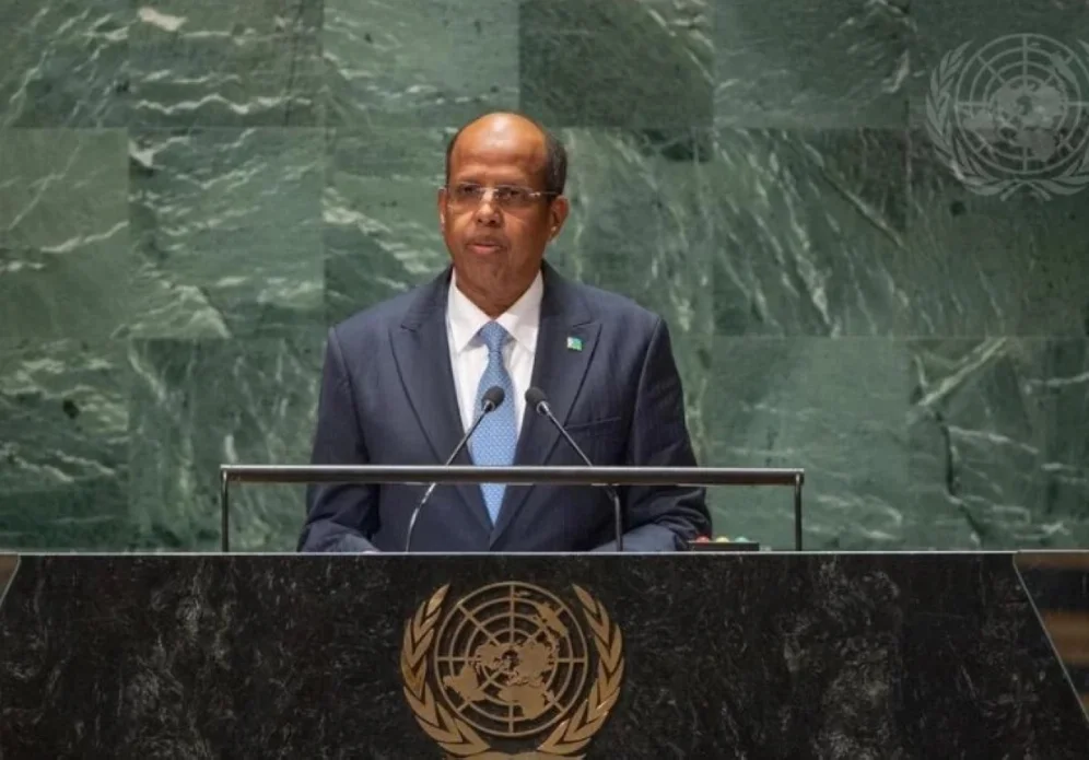
The African Union (AU) Chairperson Mahmoud Ali Youssoufhas welcomed the United Nations General Assembly’s adoption of the “Correct the Map” resolution.
Here is what the decision really means.
The UN General Assembly adopted a resolution calling for more equitable and geographically accurate representation of the world’s regions, with particular attention to Africa.
A total of 164 countries voted in favour, while the United States was the only country to vote against. Six countries — Estonia, Georgia, Lithuania, Moldova, Serbia and Ukraine — abstained.
Nigeria was among those that supported the resolution.
The measure was led by Togo on behalf of the African Group, with backing from the African Union.
At the centre of the debate is the Mercator projection, a world-map design created in 1569 by Flemish cartographer Gerardus Mercator.
The projection was developed primarily for navigation. While it is useful for sailors because it preserves certain directional relationships, it does not accurately preserve the relative sizes of countries and continents.
In reality, Africa is roughly 14 times larger than Greenland.
Areas closer to the North and South Poles are visually enlarged, while regions around the Equator appear comparatively smaller.
That has a particularly striking effect on Africa.
One of the most commonly cited examples is the comparison between Africa and Greenland.
On a conventional Mercator map, Greenland can appear similar in size to Africa.
In reality, Africa is roughly 14 times larger than Greenland.
Africa covers about 30 million square kilometres, making it the world’s second-largest continent by land area and population.
Countries such as Nigeria, Ghana, Kenya and the Democratic Republic of Congo therefore appear considerably smaller on a Mercator map than their actual geographical areas would suggest.
The resolution encourages wider use of equal-area map projections, including the Equal Earth projection, particularly where comparing the actual sizes of continents and countries is important.
Equal Earth was developed in 2018 and is designed to preserve the relative areas of landmasses.
In practical terms, Africa appears much closer to its true size when displayed alongside Europe, North America and other continents.
Does Africa actually become bigger?
The UN resolution does not make Africa bigger. It does not add territory to the continent, alter its geography or change its borders.
Africa remains exactly the same physical size.
What changes is how that size is represented visually.
There is no border adjustment involved.
Think of it like taking a photograph with a wide-angle lens: the object has not changed, but the way it appears in the image can be significantly different.
Are Africa’s borders changing? No. There is no border adjustment involved.
Nigeria remains Nigeria. Ghana remains Ghana. Egypt remains Egypt. The Democratic Republic of Congo remains the Democratic Republic of Congo.
The 54 African countries remain part of Africa, and no country is being added to or removed from the continent.
Why does a map matter so much?
Supporters of the initiative argue that maps are more than geographical tools.
They influence how children learn geography in school, how the media presents the world and how people develop an understanding of the relative importance and size of different regions.
Togolese Foreign Minister Robert Dussey made this point during the UN debate, saying maps influence people’s understanding of the world.
“Maps shape our understanding of the world. They guide education, nourish the imagination and influence collective perceptions,” he said.
For African countries, therefore, the issue is partly about correcting a longstanding visual imbalance.
The Mercator projection is not inherently a bad map. It was designed for a specific purpose — particularly maritime navigation — and remains useful for certain applications.
The problem arises when it is used to compare the actual sizes of continents and countries.
No flat map can perfectly represent the curved surface of the Earth without some form of distortion. Different projections simply make different trade-offs.
Africa will look larger relative to Europe.But there will be no change to the continent itself.
Equal-area projections prioritise preserving the relative size of landmasses, while the Mercator projection prioritises other properties useful for navigation.
The United States was the only country to oppose the resolution.
It argued that the UN General Assembly should focus its attention on more pressing global challenges.
The overwhelming support for the measure, however, demonstrates the strength of the African Group’s campaign and the broad international backing for more accurate geographical representation.
France supported the resolution and indicated plans to move away from the traditional Mercator projection for its official world maps.
What will ordinary people actually notice?
If equal-area maps become more widely used, the most obvious difference will be visual.
Africa will look larger relative to Europe, North America and other northern regions, while countries and territories near the poles will appear less oversized.
For students looking at a classroom map, viewers using digital maps for educational purposes or readers seeing a world map in the media, Africa’s proportions will look much closer to reality.
But there will be no change to the continent itself.
For Africa, the “Correct the Map” campaign is about more than cartography.
It is also about representation and perception.
The African-led initiative argues that the way the continent is portrayed visually has consequences for how its geographical importance is understood.
The UN vote therefore represents an effort to encourage the use of maps that provide a more balanced picture of the world’s geography.
In simple terms, the message is this: the map is changing, not the world.
Africa is not becoming larger, countries are not changing borders, and no new territories are being created.
What is changing is the way the world is being asked to see Africa — closer to its true size.
Read Also: Falconets Thrash New Caledonia 10-1, Set Up England Clash in U-20 World Cup Knockout
Author

Sign up for The Insight Newsletter
Get in-depth, research and data-based interpretative reports from around Nigeria.